Youniverse
Personal Psychologist Chatbot
—
• Role: Senior UX and Product Designer
• Platform: Android, iOS and Web (responsive)
• Company: Visual DNA
• Year: 2014
—
The CONTEXT
THE FOUNDER's VISION
Alex Wilcock, the founder and CEO of Visual DNA wanted Youniverse, which had started as a data-collecting personality quiz, to evolve into a virtual vault of your psychometric persona.
Starting from this vision, together with the product owner, the psychologists, the business development and marketing teams, we defined the product role and market positioning: a non-judgemental and contemporary personal pocket-psychologist. Along with IBM Watson, it was one of the first modern chatbots on the market.
ChallengE
Being a psychologist chatbot, Youniverse relied on lengthy conversations to understand its users. This raised the following challenges:
• All conversation topics had to benefit the same discoverability level
• We had to find a way to present this sheer amount of content without discouraging users
• We wanted them to be able to start any topic in any order, quit, switch and resume at will
• This whole system had to be scalable
• On top of that we needed users to inform us about their mood so psychologist could adapt the conversational tone
ProcesS
Each product of VisualDNA’s portfolio has a dedicated self-organised team. We worked in Agile SCRUM. Each member of our team handled the Scrum Master role on a turn based cycle. Design was given a sprint ahead of implementation.
Features ideas were prioritized then designed and tested following an iterative Lean UX approach.
—
My role as senior ux and product designer
Ensuring users flow smoothly across the vast content crafted by the psychologists. Applying pillars of UX design principles to leverage well adopted gestures from popular apps such as Spotify and Soundcloud and validating the design through:
• User interviews
• Guerrilla testings (using InVision and Just-In-Mind prototypes)
• Analyzing traffic (with Google Analytics)
• Analyzing heat maps and mouse flows (using HotJar)
• Analyzing remote recorded user-tests (using UserTesting)
• User interviews
• Guerrilla testings (using InVision and Just-In-Mind prototypes)
• Analyzing traffic (with Google Analytics)
• Analyzing heat maps and mouse flows (using HotJar)
• Analyzing remote recorded user-tests (using UserTesting)
Coordinating and bridging between/with the following teams:
• The iOS and Android engineers
• The responsive-web version front-end engineers
• The back-end engineers
• The content creators and visual designs
• The strategists and business developers
• The iOS and Android engineers
• The responsive-web version front-end engineers
• The back-end engineers
• The content creators and visual designs
• The strategists and business developers
Reporting to:
• The product owner
• The company brand director (regarding Youniverse' new branding and UI design)
• The product owner
• The company brand director (regarding Youniverse' new branding and UI design)
—
Outcomes
Youniverse scored an average of 8:13 minutes visit duration and a bounce-rate as small as 1.60%. It received up to 4.5 stars on the App Store and 5 stars on Google Play.
Visual DNA was acquired by the Teddy Sagi Group in April 2015. Several products and Youniverse were shut down as the company pivoted.
—
What I learned
Habituation doesn’t only build users’ mastery of a UI. Interactions tailored to casual users may become frictions to power users' eyes.
No matter how many people test a feature before release, some design flaws only come to light when a product reaches a solid level of engagement and retention.
—
WORK SAMPLE
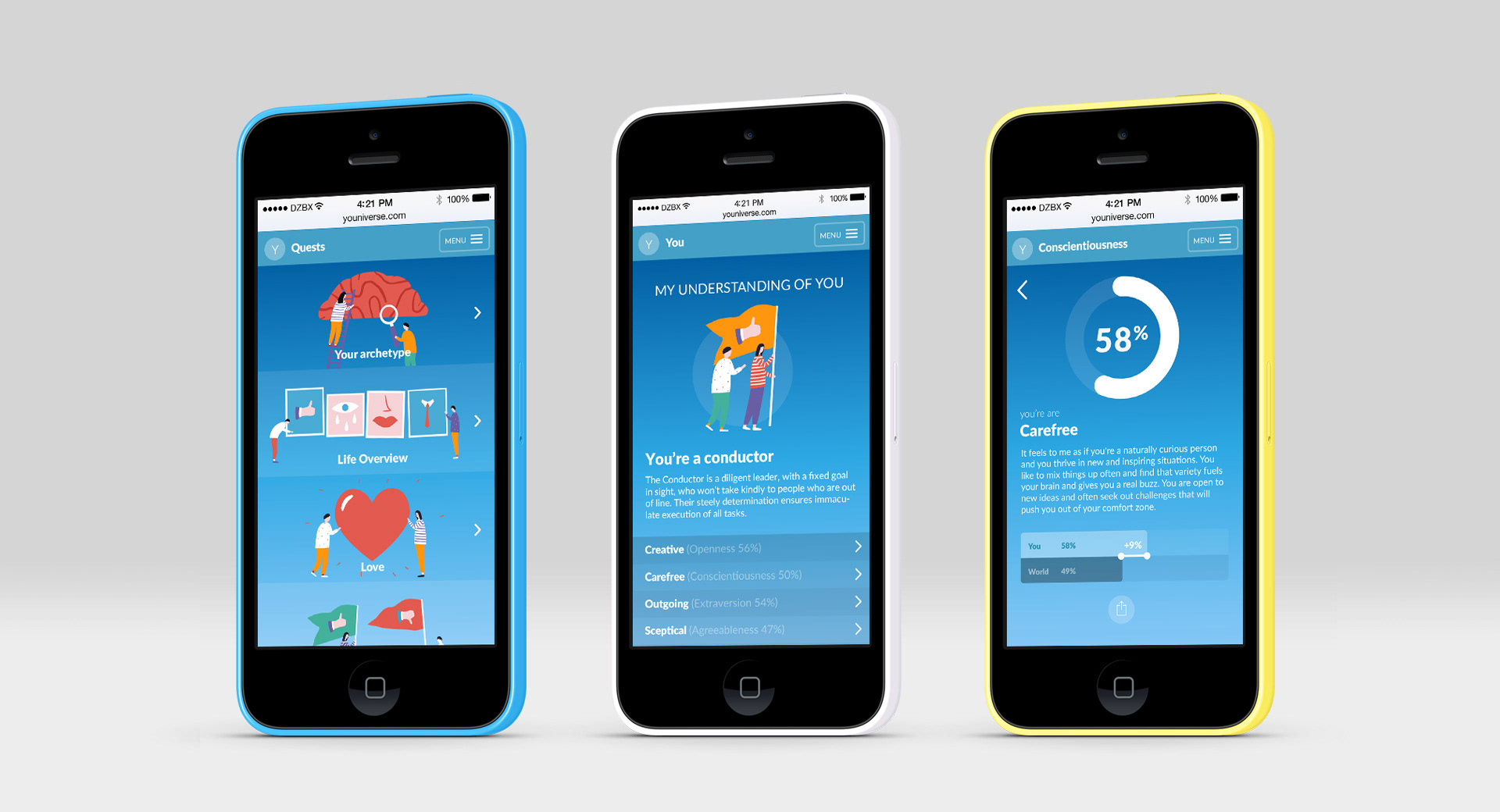
1. Conversation navigation
• Exploration
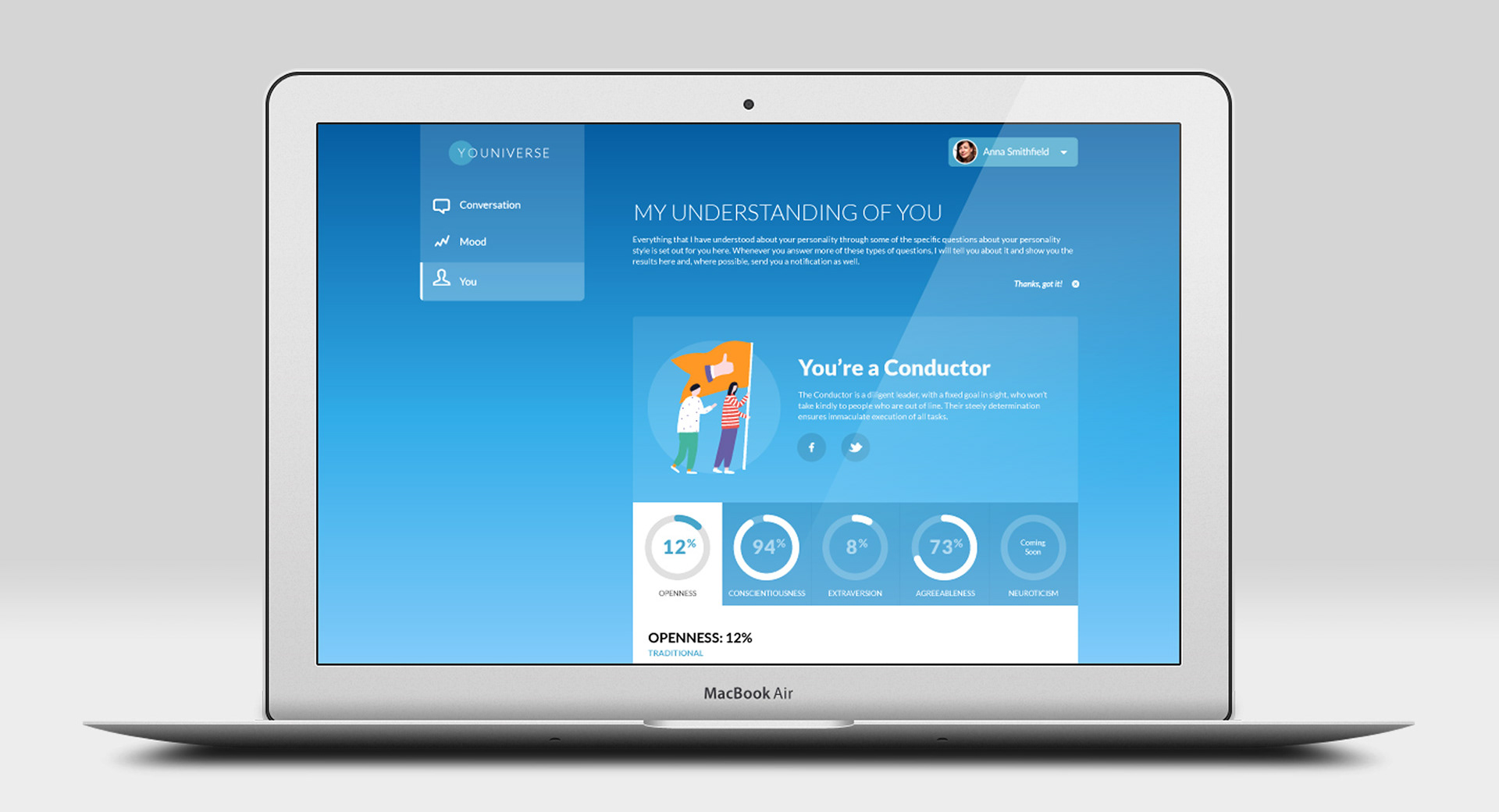
Our psychologist broke the whole conversation down by personality quests, with each quest made of several conversation sessions. I researched how to articulate the sessions and how users would navigate the quests. The first idea that seemed to match our need was the flower metaphor, but we quickly found out it didn't work well as an interactive device.
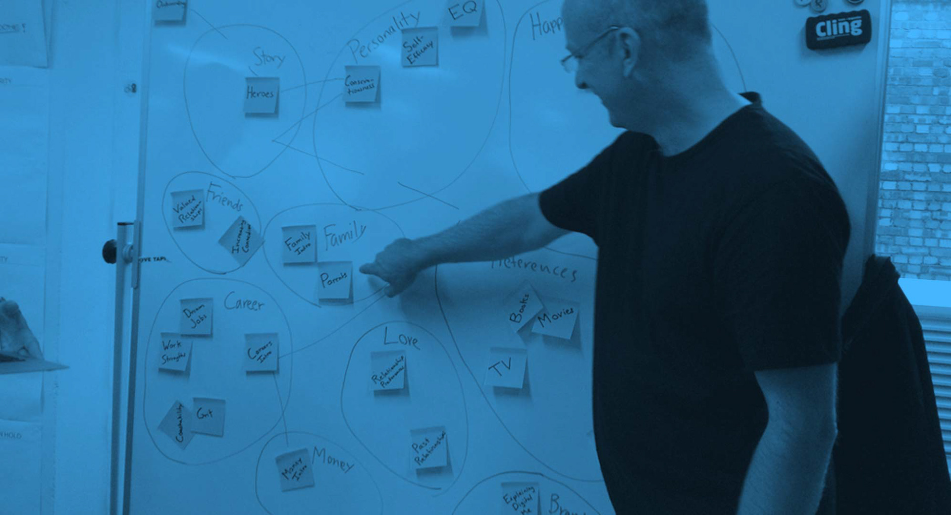
Mandatory post-its and whiteboard picture for a proper UX designer portfolio 😉
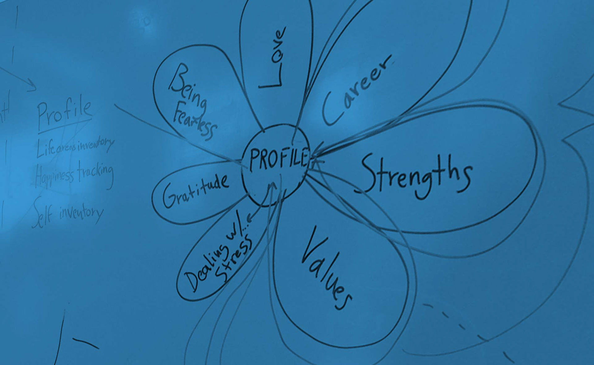
The flower metaphor thingy we didn't keep
• The starmap metaphor
The next idea was a starmap. Our quests would be galaxies and the conversations would be the stars forming these galaxies. Users would draw their personality constellation while travelling from one conversation star to another. The shape of the constellation would become their user profile. Furthermore, besides tackling an interaction challenge this solution also consolidated the branding. The astronomical aspect correlated well with the product's name.
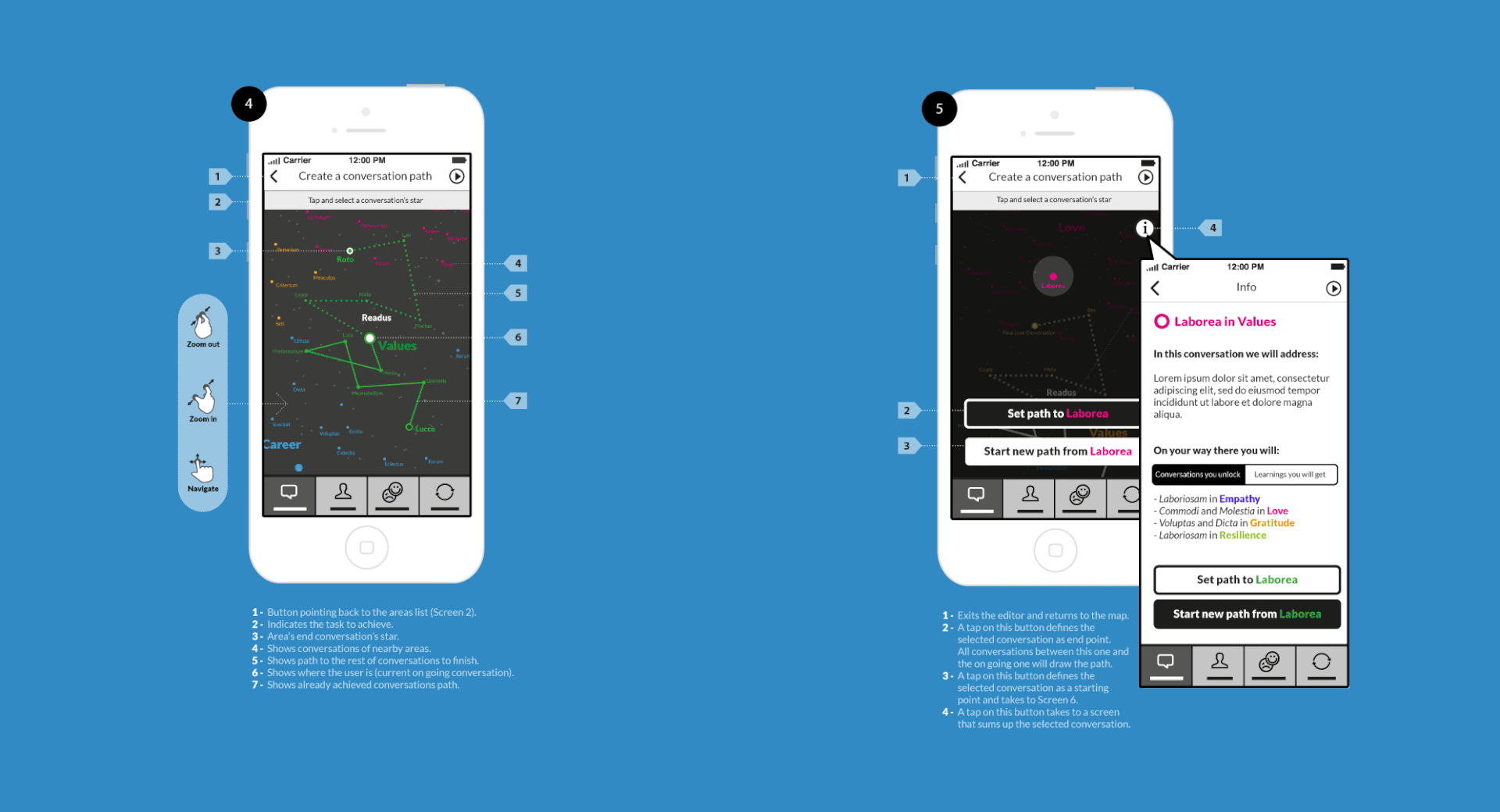
The starmap concept was borrowed from a Sci-Fi MMORPG called Eve Online and Sky Guide, an amateur astronomy app
• Negative feedback
However, feedbacks from prototype tests revealed that this feature may not appeal to people with a more pragmatic usage. Also, since Youniverse was to be released as a web app (along native Android and iOS apps) our engineers dreaded the building cost of a cross-platform responsive version of such a system. We had to turn this feature into a nice-to-have and I was back to the drawing board.
• The solution
The next idea I suggested was to use the music player paradigm (think Spotify or Deezer). This time, quests were music albums and conversations tracks. This also would allow users to start a quest, quit, switch to another one and resume at will. They would even be able to create custom playlist of conversations. This system was scalable and technically easier to achieve so we went for this one.
I scanned my sketches and used them directly in InVision to run guerilla testings
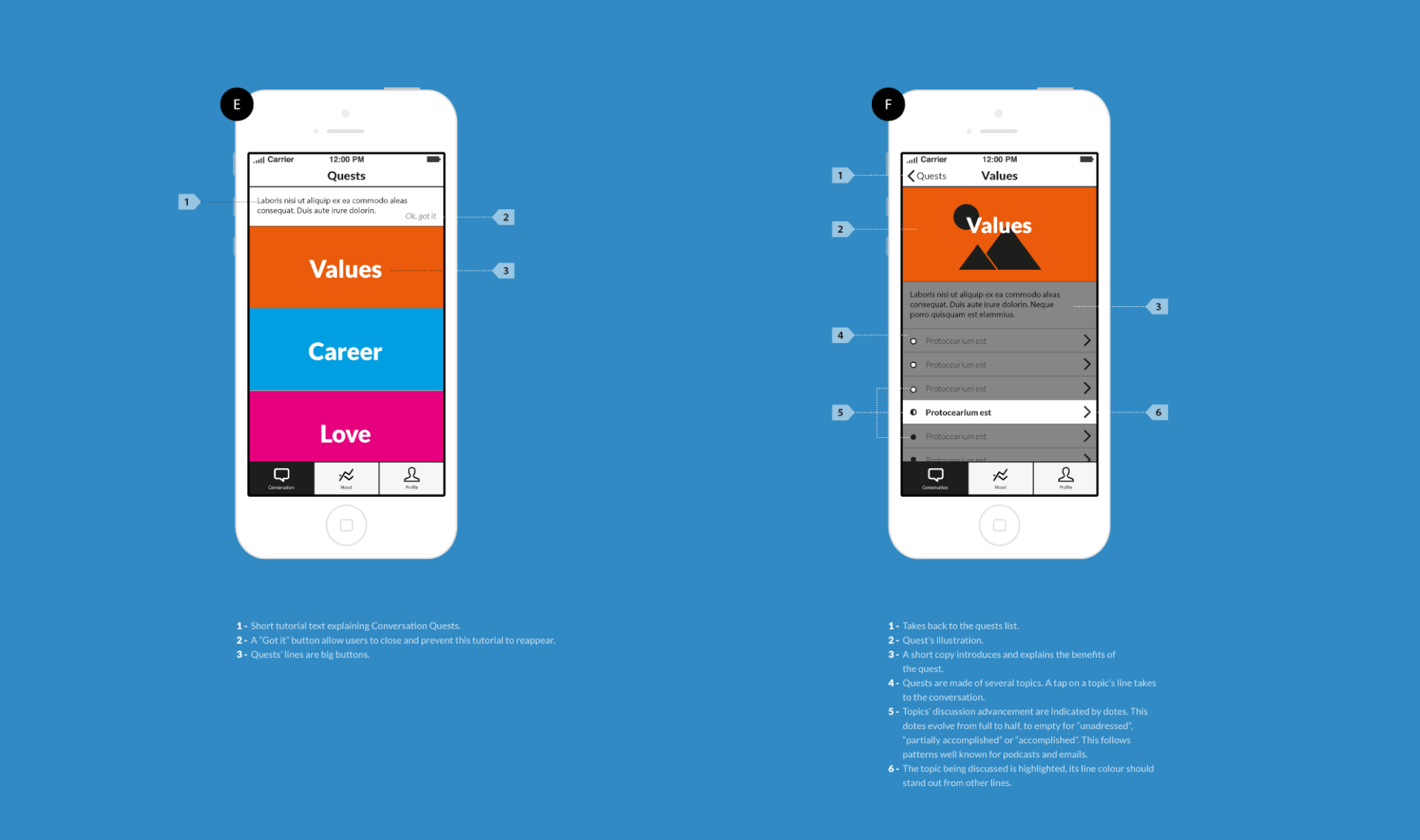
Final wireframe after several iterations&@ of the same idea
—
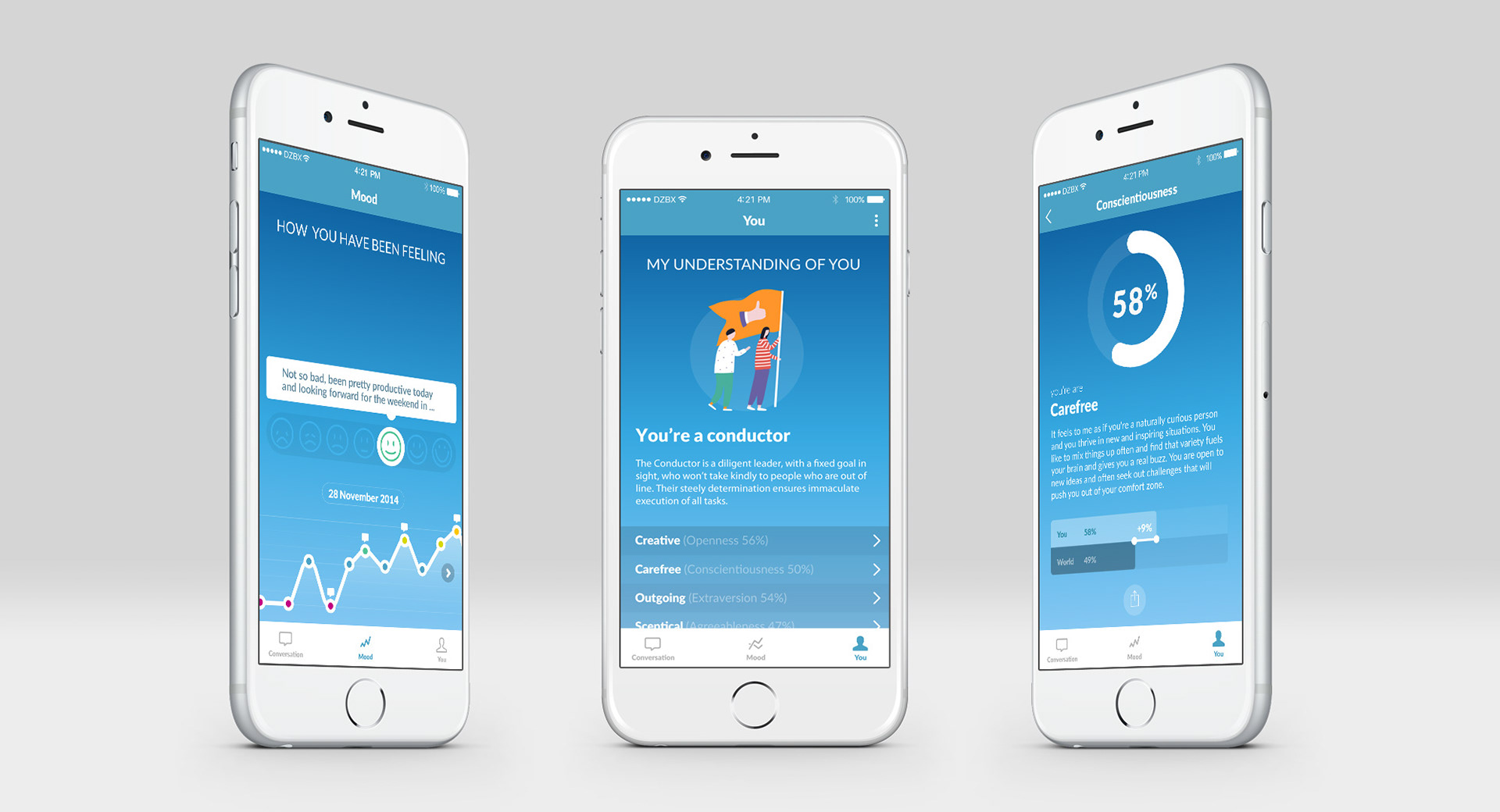
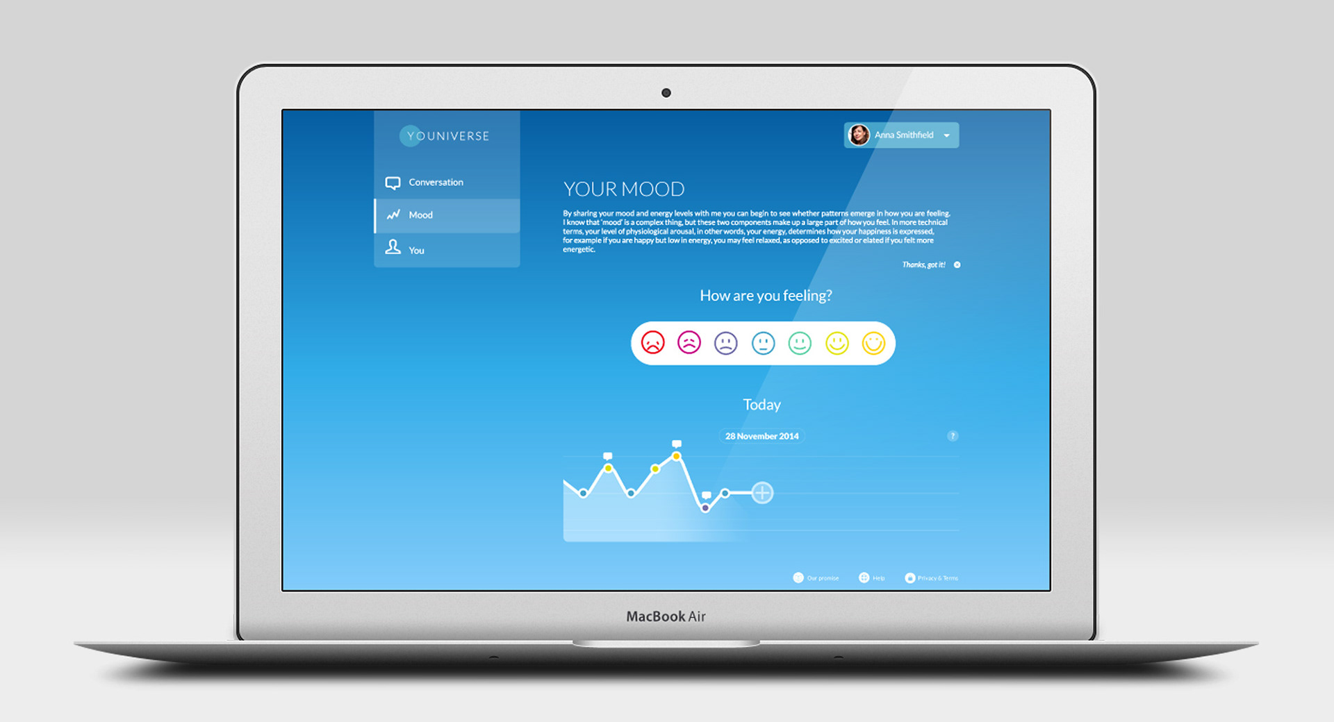
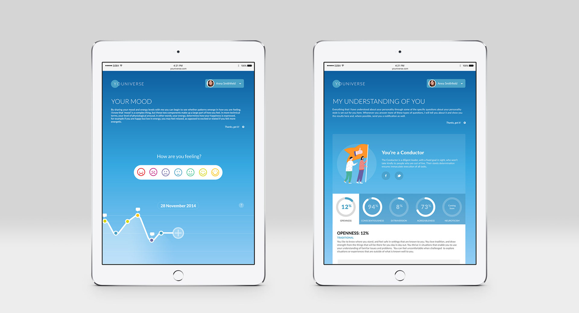
2. Users mood capture
The mood tracker was the second key feature of Youniverse. It was there from the MVP release but there was an issue with its interaction design. It used facial recognition by default and we felt this was very innovative (this was in 2014, we knew nothing of Apple's iPhone X plans). Users would only needed to look at the camera, make a face, the app captures the facial expression and that expression was registered as their mood. Their was a slider available but this was a secondary option.
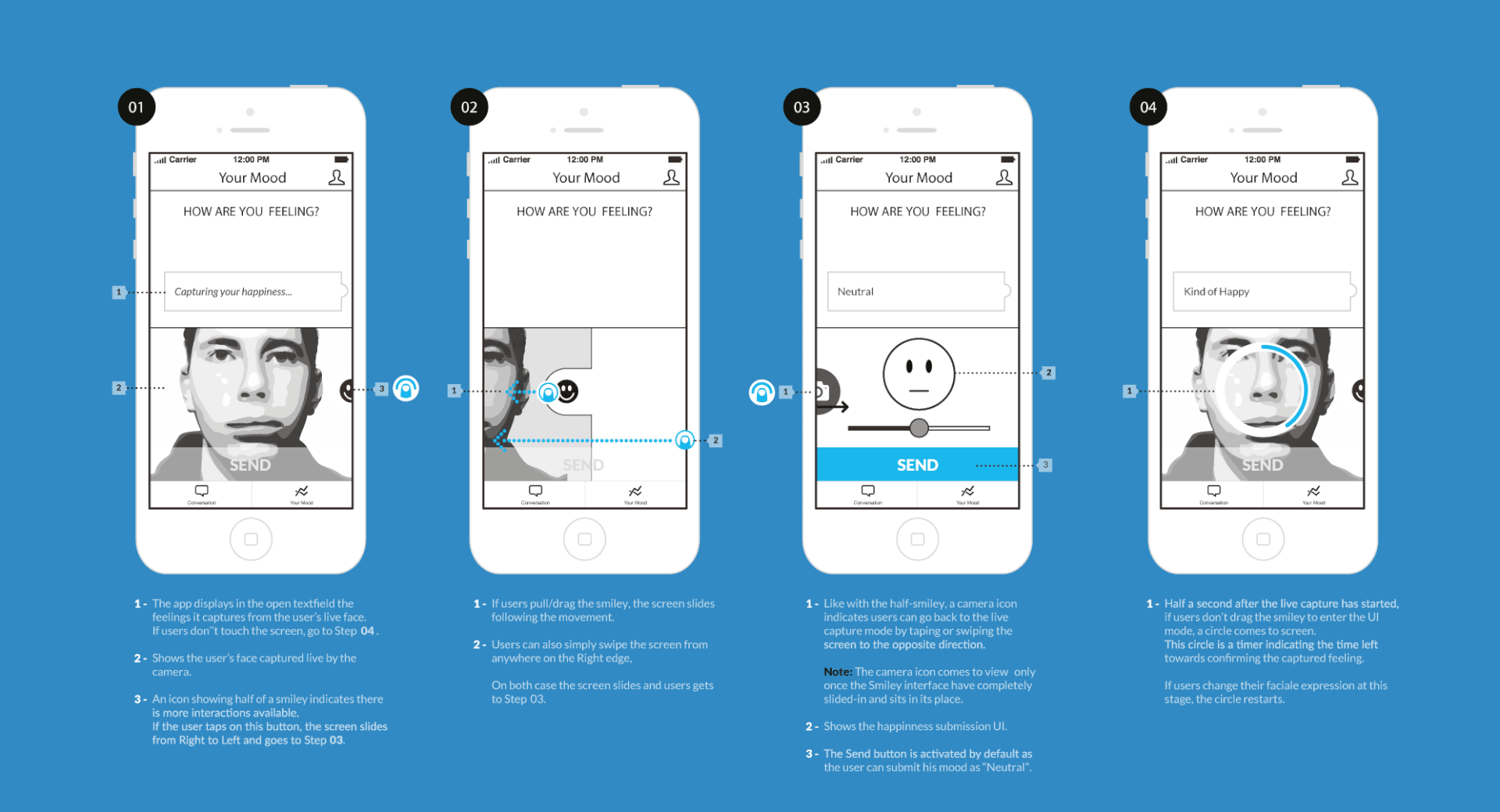
• User feedback
It appeared that making faces, although quick, was very annoying over time. This didn’t show during tests, which had asked to use this feature only once, as we were more concerned with the discoverability and intuitivity of the gesture. The Mood section was unpopular. Analytics showed a huge drop-off on this screen. The few who came back to this tab systematically skipped to the slider version.
• Iteration
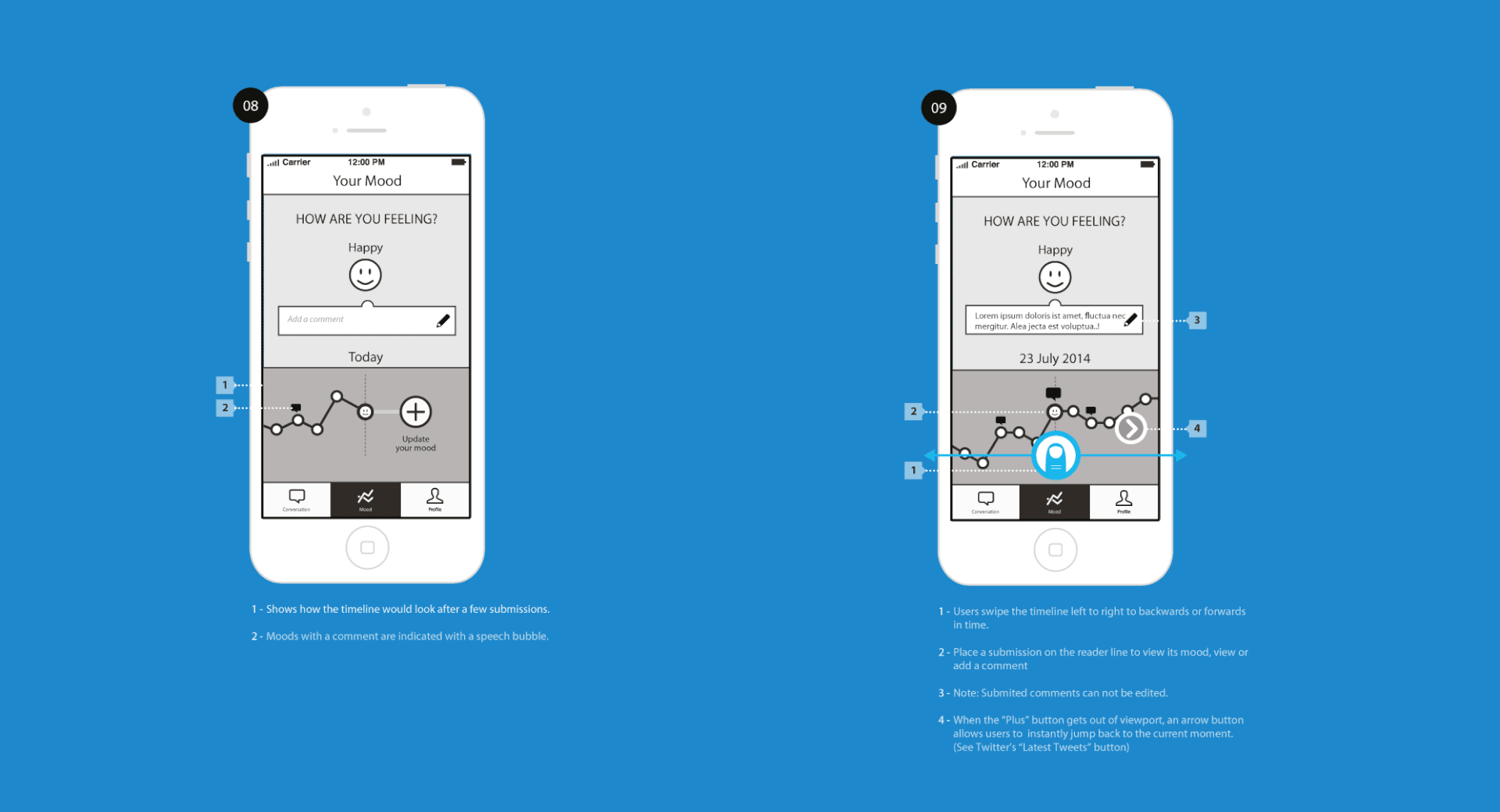
So I went back to the drawing board and, besides removing the camera feature thingy, I condensed the mood submission process to two screens. Also, as users may only want to review their mood evolution without uploading feelings, I brought the mood summary chart at the home of this tab. A button at the bottom of this screen would then call users to update their feelings and take them to the sub-screen. On the sub-screen, I put both the Happiness and the Energy slider in a row, with one single button to submit both feelings.
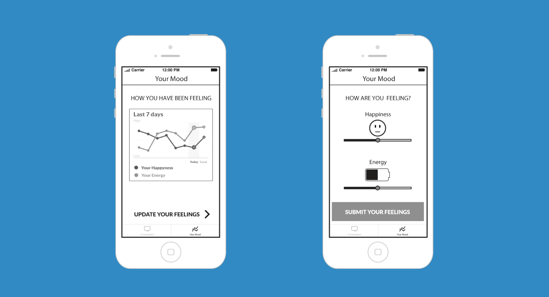
• Yes, but...
The new version improved the flow and this positively reflected in the analytics. However, there was still a friction. Users seemed reluctant to update their Energy state while engaging with the Happiness submission. Fortunately, a discussion with our psychologists highlighted that the Energy insight was in fact not a crucial factor. So I decided to remove it and focus on Happiness alone.
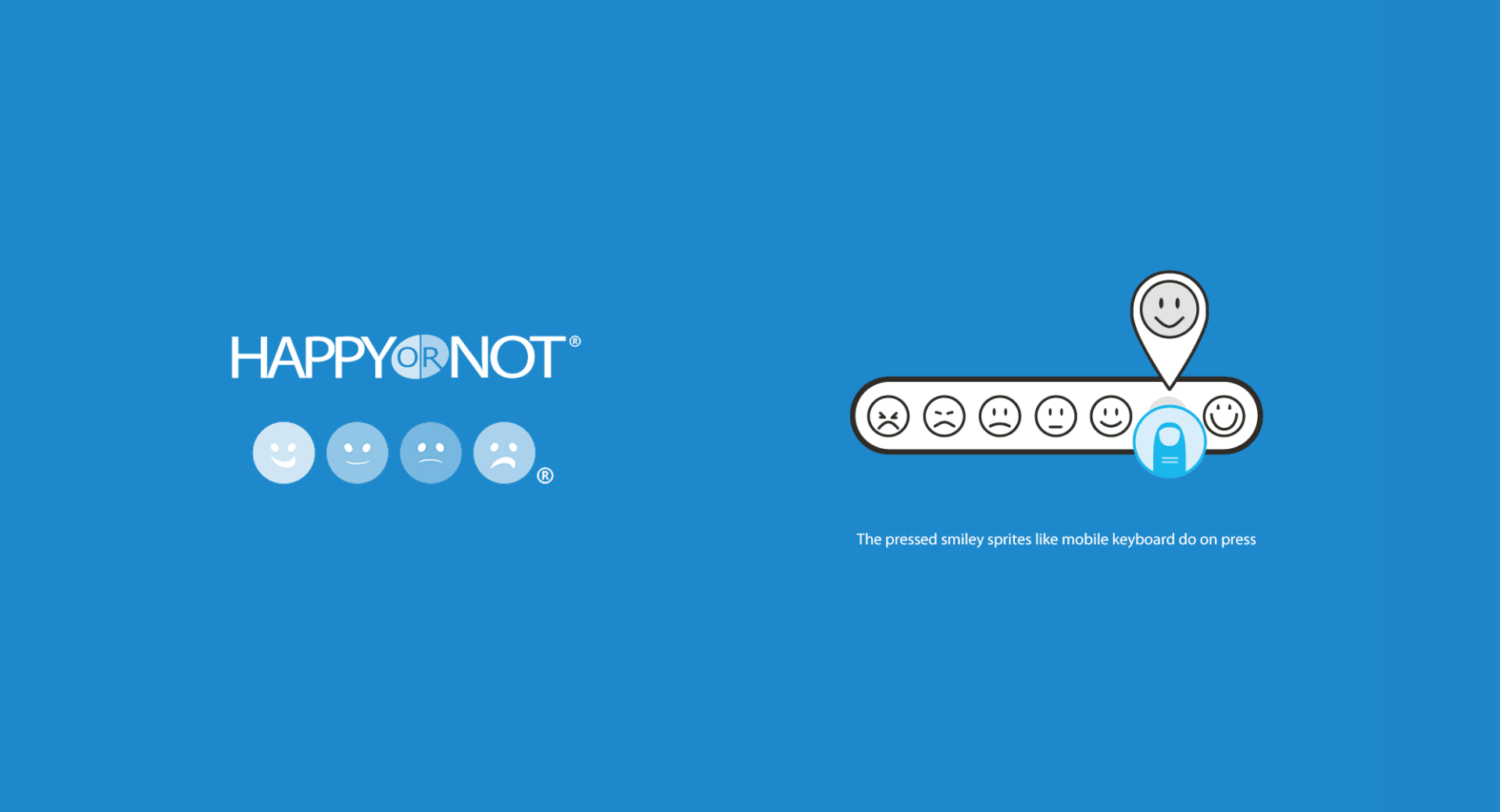
In the meantime, the slider lacked to show upfront the various levels of feelings. Users had to slide the handle to see the mood variations expressed through a smiley on top of the slider. There was a discoverability issue. So I decided to adopt the system used by the Happy-Or-Not Terminals. These devices allow to collect customer feedback in public spaces in a very simple way: press the smiley that matches your opinion and off you go!
• The real solution
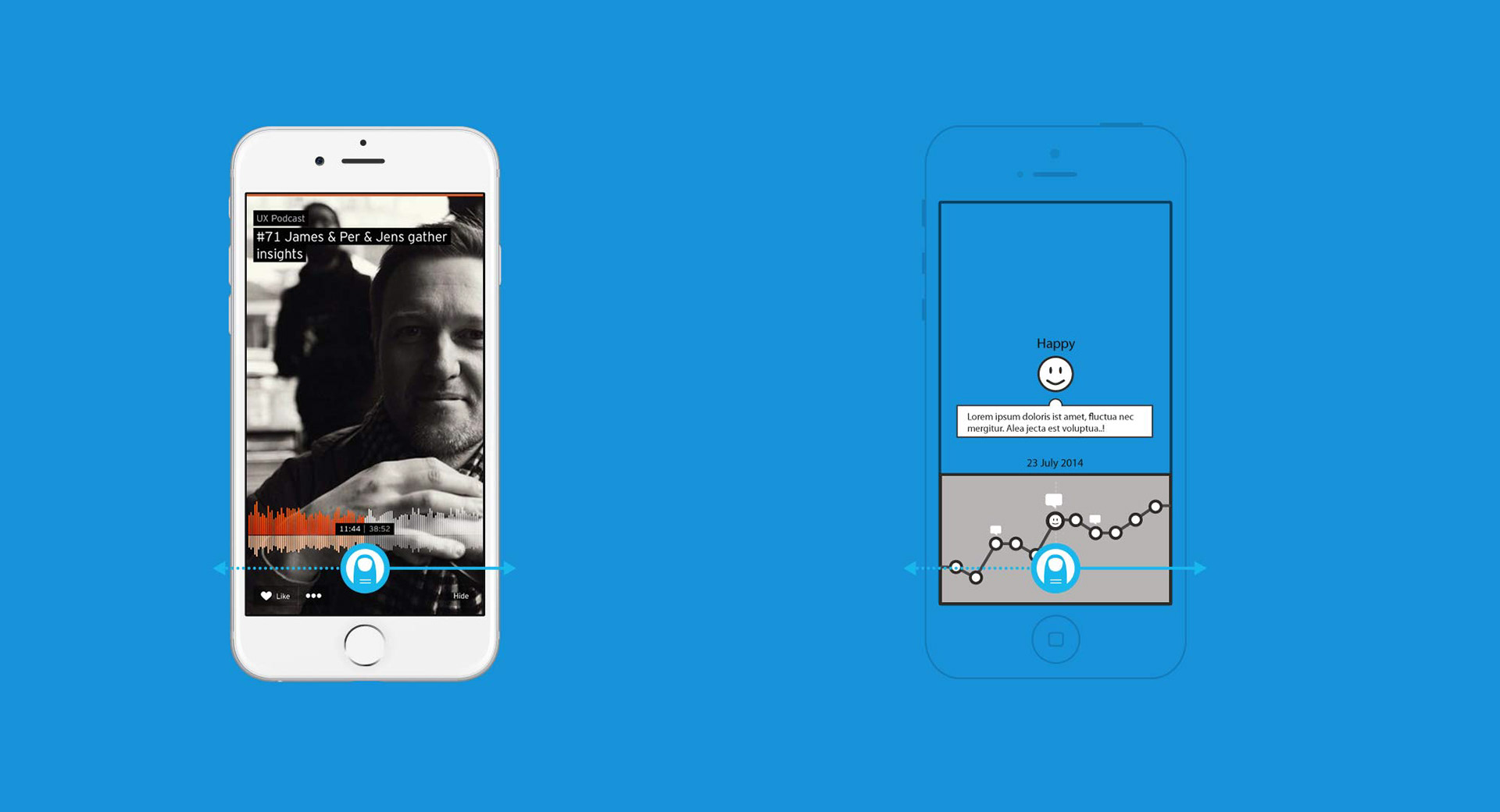
I also realised that, despite our mobile first strategy, our mood summary chart followed a design pattern inherited from print and the desktop screen. So I began searching for a solution that would sit better in the mobile era.
The solution came to my mind while using SoundCloud. This app allows users to fast forward or rewind tracks by dragging the waveform. My idea was to use the same scrolling interaction to review one’s mood history. Even better, as the top of the viewport remains free, this left enough room to have both the smiley scale and mood timeline in one single screen.

• Teamwork with the engineers
Although part of the Creative Department, I asked to sit with the engineers team. They have a clear view on the build's intricacy and I value their ability to predict potential edge-cases. We saved a lot of time by tweaking details right in the code while implementing. This close-knit cooperation allowed to fix frictions and release updates in record time.

The iOS engineer (left), my beloved laptop (in the middle) and the Front-End engineer (right)
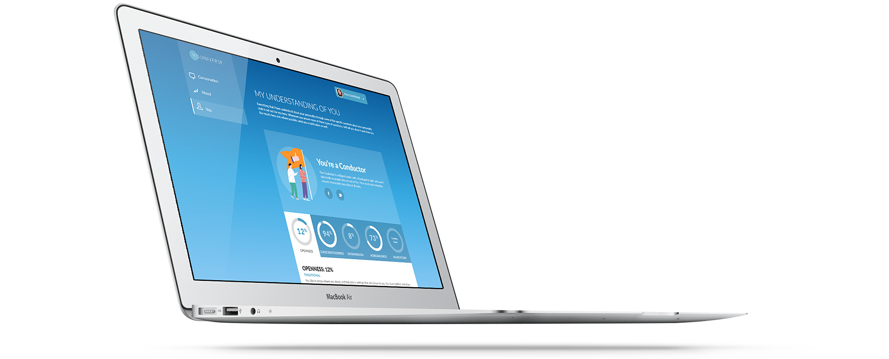
• UI design
Besides managing the interaction design, as the product designer my role also extended to leading Youniverse's rebranding. My solid industry experience as digital creative and art director helped me a lot.
On the one hand I evolved the previous look-and-feel to a lighter up-to-date flat design minimalism. On the other, I reinforced the brand by adopting Rose Blake's illustrations from VisualDNA's existing company branding. The idea was to start a unified visual language across all products of the company.
On the one hand I evolved the previous look-and-feel to a lighter up-to-date flat design minimalism. On the other, I reinforced the brand by adopting Rose Blake's illustrations from VisualDNA's existing company branding. The idea was to start a unified visual language across all products of the company.
• iOS
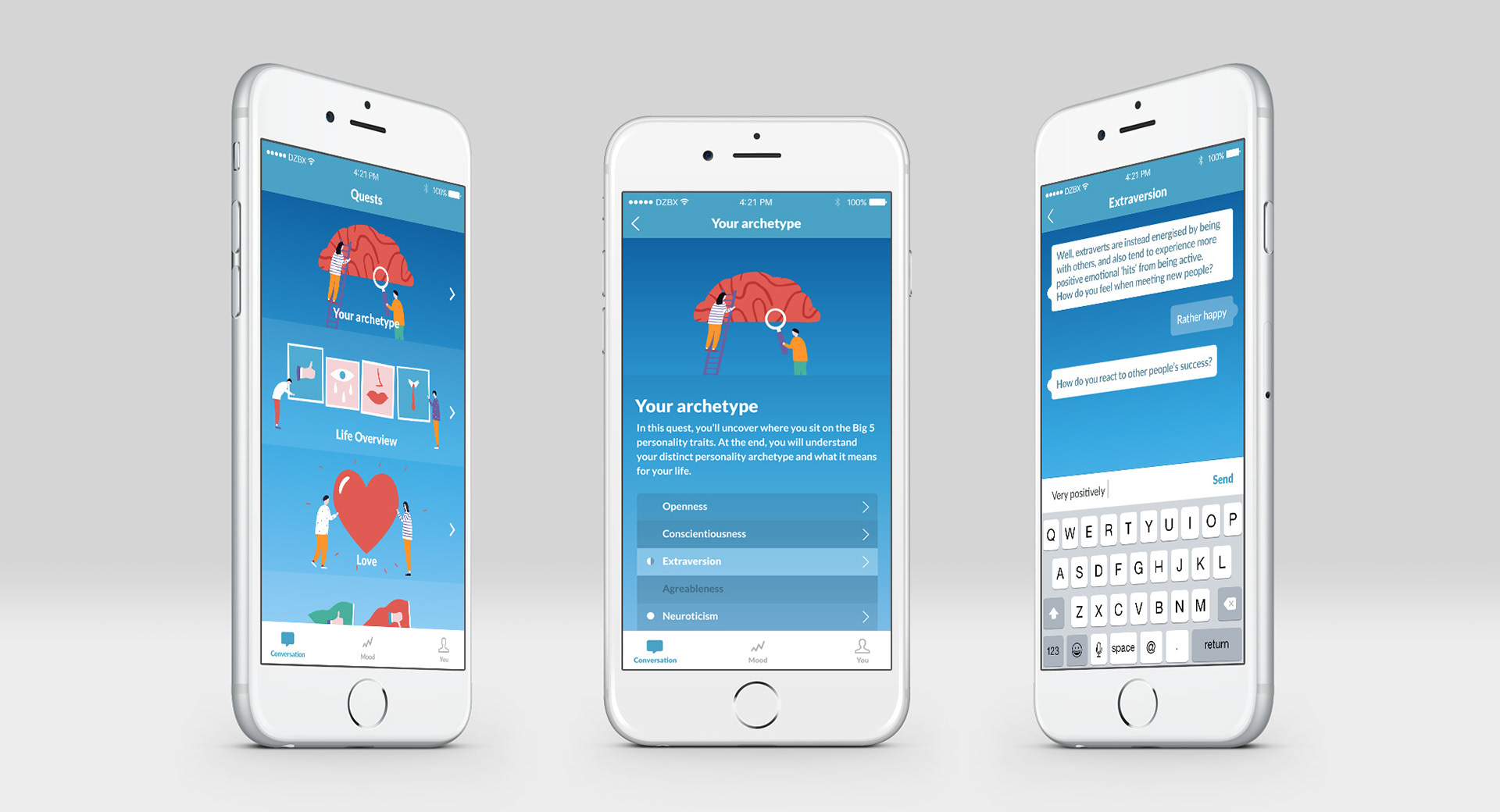
iOS version with platform specific bottom navigation bar
• Android
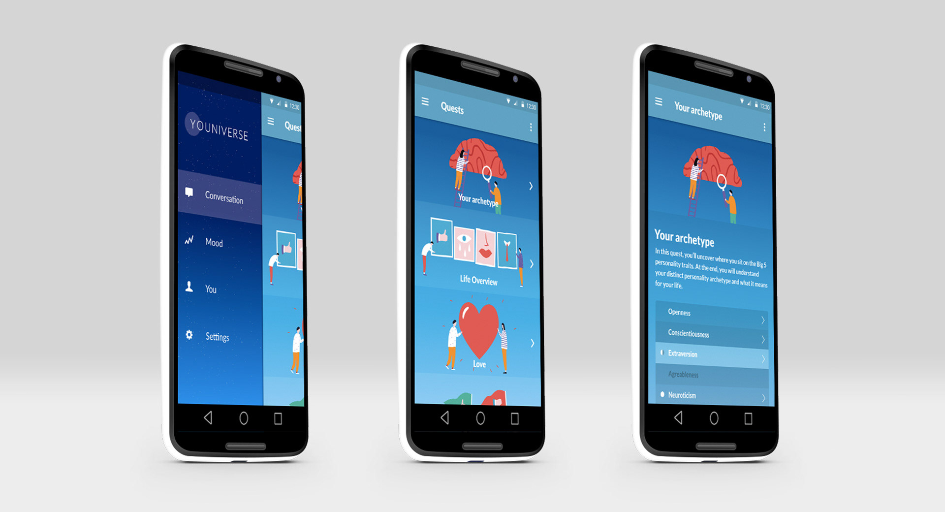
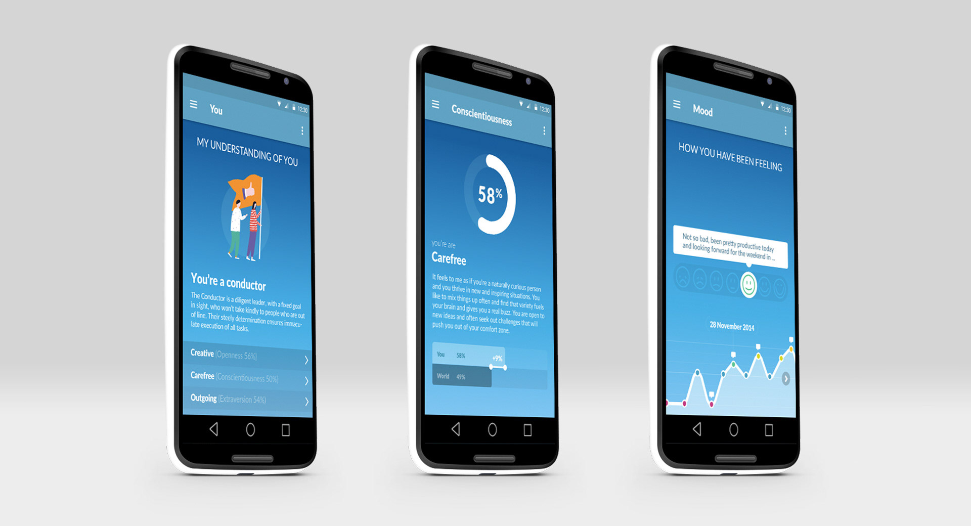
The design was started before the release of Material Design
• Responsive web-app
—
Thanks for reading!